You do not need a massive marketing budget or a full-time creative department to make your business look established.
You do need design that feels intentional.
Customers make fast judgments online. Before they read your About page, compare your pricing, or understand what makes your business different, they notice how your brand looks. Inconsistent colors, blurry images, crowded flyers, and slightly questionable font choices can make a legitimate business feel less credible than it is.
Harsh? Maybe. True? Also yes.
Here are 10 practical ways to improve your visual presence without pretending you have a Fortune 500 design budget.
Your brand identity is not just your logo. It’s the visual system that helps people recognize your business across your website, social media, presentations, emails, and marketing materials.
Start by defining the basics. Choose a core color palette, a small set of fonts, an image style, and a clear approach to layouts. Each element should reflect the kind of business you are and the kind of customer you want to attract.
A modern software company and a neighborhood bakery should probably not look the same. That is the point.
Nothing makes a brand look smaller faster than inconsistency.
Your website uses one shade of blue. Your Instagram graphics use another. Your sales deck has a different logo, and the flyer someone made six months ago appears to belong to an entirely different company.
Small inconsistencies may seem harmless, but together they make a brand feel disorganized.
Create simple brand guidelines that cover your logo, colors, fonts, imagery, and visual style. Then apply those standards across every customer touchpoint.
Consistency builds familiarity, and familiarity builds trust. It also saves your team from starting from scratch every time someone needs a social graphic.
When your brand looks different on every platform.
Color can shape how people feel about your business, but that does not mean you need a 12-color palette and a degree in color psychology.
Choose two or three primary colors that reflect your brand, then add one or two supporting colors for backgrounds, accents, and calls to action. The colors should complement each other and create enough contrast to keep your content readable.
Your palette also needs to work in real life. Test it on your website, social posts, presentations, printed materials, and mobile screens. That perfect pale yellow may look lovely in a mood board and completely disappear when used for text.
A focused palette makes your brand more recognizable and your designs much easier to manage.
Your 12-color palette, as reviewed by every customer.
Let Creative Shizzle help you build a visual identity that looks as established as your business actually is.
Fonts are a lot like seasoning. A little variety helps. Too much and suddenly nobody knows what they are looking at.
Most small businesses only need two or three fonts. Use one for headlines, one for body copy, and an optional accent font when the brand genuinely calls for it.
Your typography should also create a clear hierarchy. Headlines should look like headlines. Supporting information should be easy to scan. Body copy should be comfortable to read without zooming in or holding the screen six inches from your face.
Decorative fonts can add personality, but they should not make your audience work to understand the message. Clarity wins.
A flyer should not try to explain your entire company history, promote four services, announce an event, feature six testimonials, and send people to three different links.
Every design needs one primary goal.
Before you begin, decide what the audience should understand or do after seeing it. That goal should guide the headline, layout, imagery, and call to action.
Should it get someone to click? Understand an offer? Sign up? Show up? Buy something? Once you know the goal, everything else gets easier.
When everything is important, nothing stands out.
Every flyer trying to do 47 jobs at once, colorized.
Small businesses love getting their money’s worth out of every inch of a design. The result is usually tiny text, crowded layouts, and graphics that feel more stressful than persuasive.
White space is not wasted space. It gives your content room to breathe and helps people understand what matters first.
Use spacing to separate sections, create hierarchy, and guide the reader through the design. Resist the urge to fill every open area with another icon, badge, paragraph, or stock photo of people pointing at a laptop.
Clean design often feels more premium because it communicates confidence. It says your message is strong enough to stand on its own.
We build the system — and then design everything inside it. One subscription, zero hiring headaches.
Generic stock photography can make even a great business look generic.
Whenever possible, use real images of your team, products, customers, workspace, or process. Authentic photography gives people a clearer sense of who you are and makes your brand easier to remember.
When stock imagery is necessary, choose images that match your brand’s personality and audience. Avoid mixing dramatically different photography styles or using the same overly familiar photos everyone has seen in a dozen ads.
Illustrations, icons, and custom graphics can also strengthen your visual identity. Just keep the style consistent. A sleek line icon should not suddenly share a layout with a cartoon illustration and a hyper-realistic 3D graphic unless there is a very good reason.
Don’t have your clients doing this.
One design does not work everywhere.
A graphic created for LinkedIn may be cropped on Instagram. A presentation slide may become unreadable when turned into a social post. A printed flyer needs different technical considerations than a digital advertisement.
Design each asset around where and how people will see it. Consider dimensions, viewing distance, screen size, file format, and how quickly the audience will engage with it.
Mobile readability matters most for digital content. Keep text large enough to read, simplify the message, and check the final design on an actual phone before publishing it.
Repurposing content is smart. Copying and pasting the exact same design across every channel is where things get messy.
When the platform specs have been posted for years and the design still gets cropped.
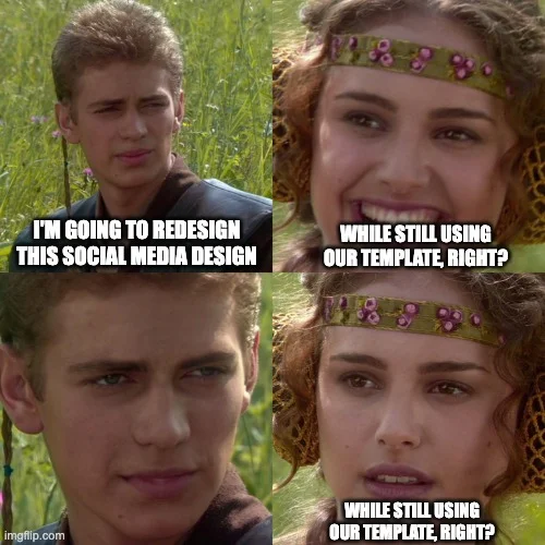
Canva and other DIY design tools can be incredibly useful when you need something quickly. Templates give small businesses a starting point and make it easier to maintain a steady content schedule.
The problem begins when the template becomes the brand.
Swap in your actual colors, fonts, imagery, and visual elements. Remove anything that does not support the message. Adjust the layout so it feels intentional rather than borrowed.
Creating a set of custom branded templates can make this much easier. Your team gets the speed of DIY design without every post looking like it came from a completely different company.
Templates should support your brand, not define it.
Templates are great. Template energy is a whole other thing.
DIY design can save money when you are starting out. It can also quietly consume hours that should be spent serving customers, building relationships, or growing the business.
It may be time to bring in professional support when your materials look inconsistent, important campaigns keep getting delayed, or you avoid promoting your business because creating the graphics feels overwhelming.
Professional design is especially valuable for high-impact projects such as logos, brand guidelines, websites, presentations, event materials, sales collateral, and campaign assets. These pieces often shape how potential customers, partners, and investors perceive your business.
Campaigns are where DIY quietly costs the most. A launch, a live event, a seasonal push — these are the moments your brand is under the most eyes, on the shortest timeline, and with the least room to look off. Vector’s team put it well when they talked about their own campaign work: some efforts aren’t meant to scale, but the ones that shape a moment in market deserve craft, not a scramble in Canva at 11pm.
You do not necessarily need to hire a full-time designer or commit to a long agency contract. Sometimes you simply need one important project handled properly.
When DIY design becomes a second full-time job.Don’t have your clients doing this.
— Jess Cook, Vector, How we designed an owned event series that generated $880K in pipeline
Creative Shizzle’s Design Cart gives you professional design support without the long-term commitment.
Great design does not magically make a small business bigger, but it does make the business easier to trust, easier to remember, and easier to choose.
Start with a consistent visual identity. Keep your layouts focused. Use colors, typography, and imagery with intention. Most importantly, make sure every design supports a clear business goal.
You can handle plenty of everyday graphics with the right templates and tools. When the project matters too much for another DIY experiment, getting professional support can save time, strengthen your brand, and help your business show up like it is ready for bigger opportunities.
Will Novelli is a Happiness Manager at Creative Shizzle, professional Reddit researcher, and community building enthusiast. When he’s not uncovering marketing insights or helping to produce/host Talking Shizzle, you’ll find him exploring Philly’s food scene or crafting the perfect meme. He believes the best marketing happens when real people have real conversations.
Join our mailing list to get our updates and marketing and design tips and tricks.
We use cookies to enhance your browsing experience, serve personalized ads or content, and analyze our traffic. By clicking "Accept", you consent to our use of cookies. You can manage your preferences or withdraw consent at any time.